Here’s a map that shows the percentage of adults 18 to 64 years of age who live in poverty.
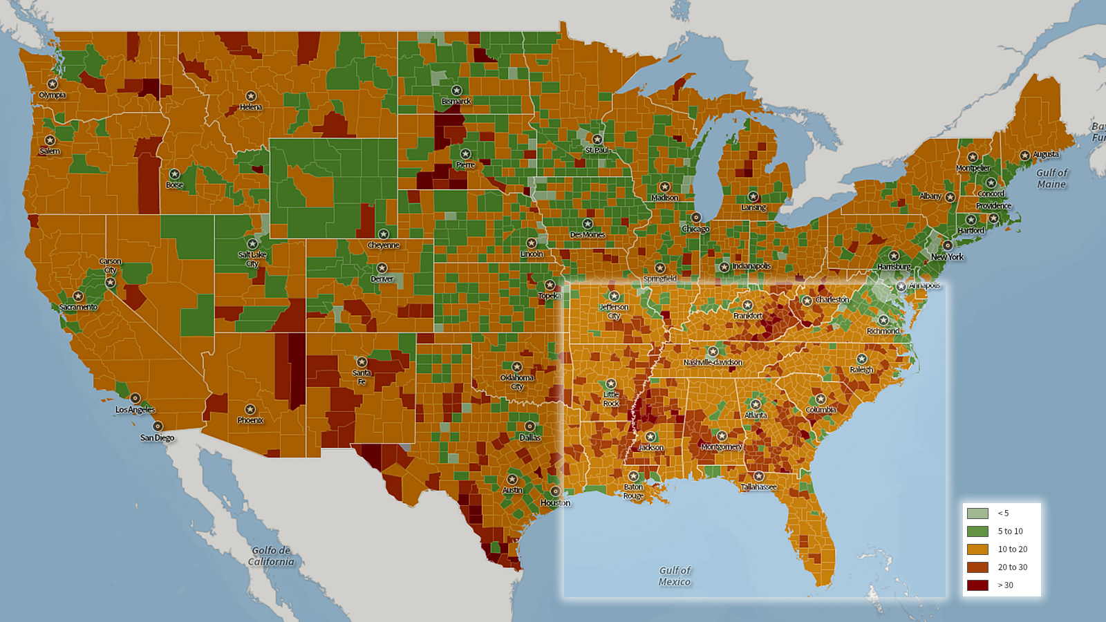
The redder the county, the higher the poverty.
The Center for a Better South
Here’s a map that shows the percentage of adults 18 to 64 years of age who live in poverty.
The redder the county, the higher the poverty.
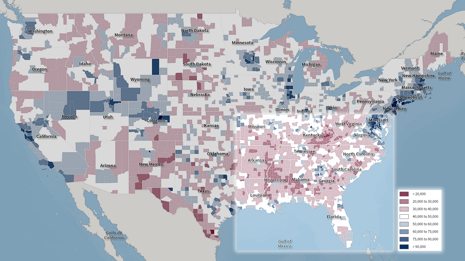
Median household income, 2010
Source: U.S. Census, image by Center for a Better South via SocialExplorer.com
The maroon and pink counties indicate a lower median household income.