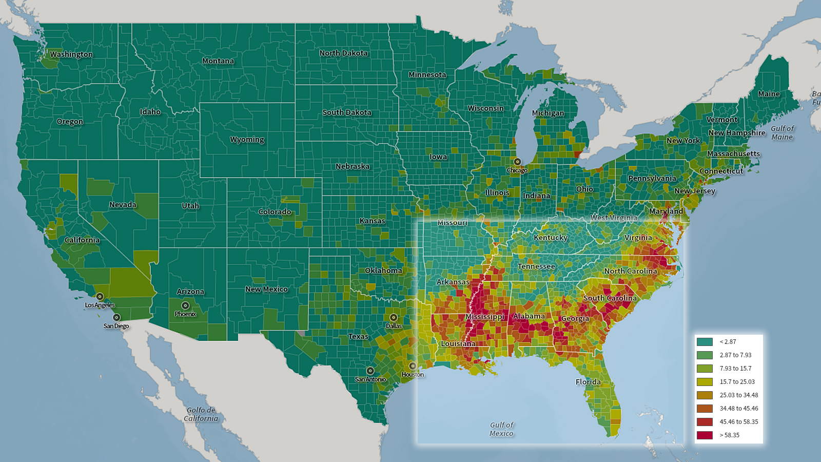
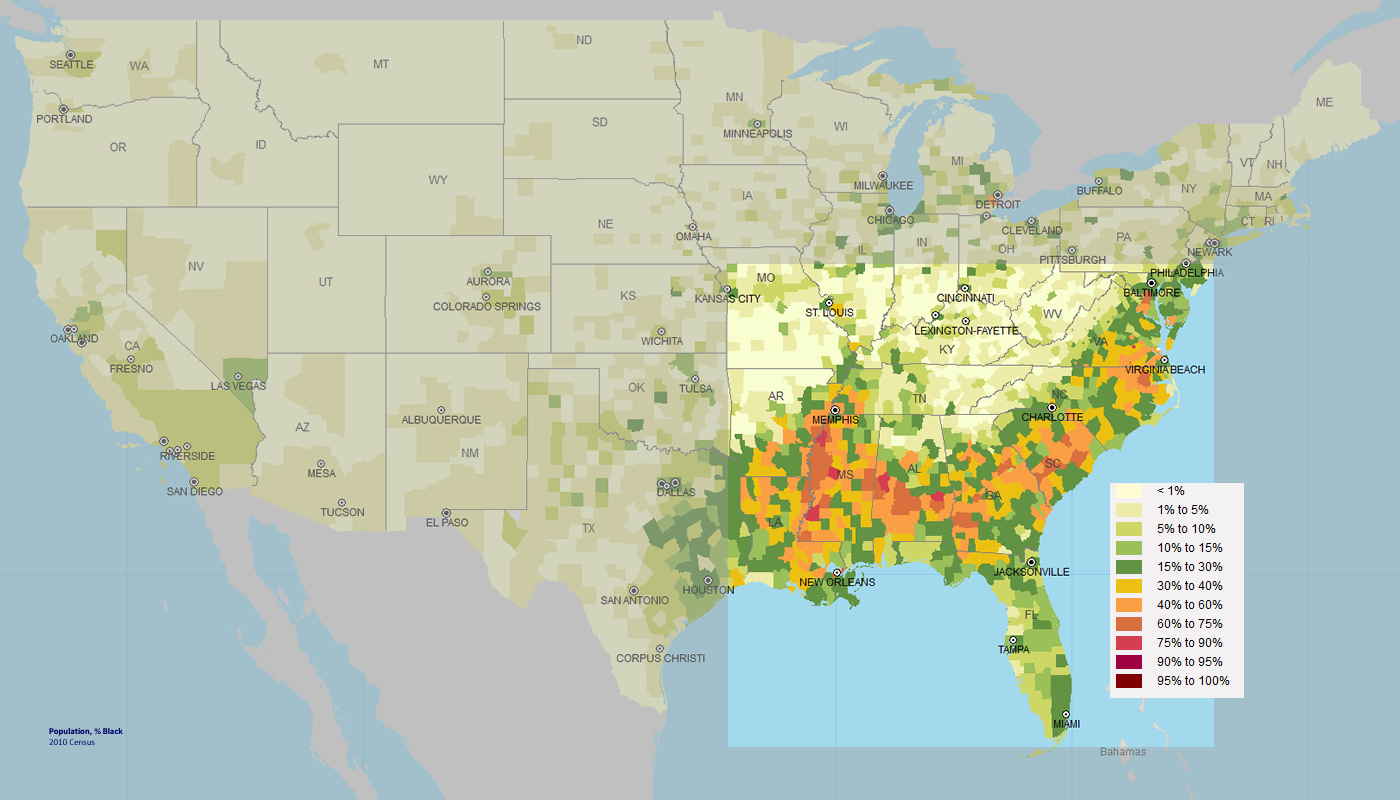
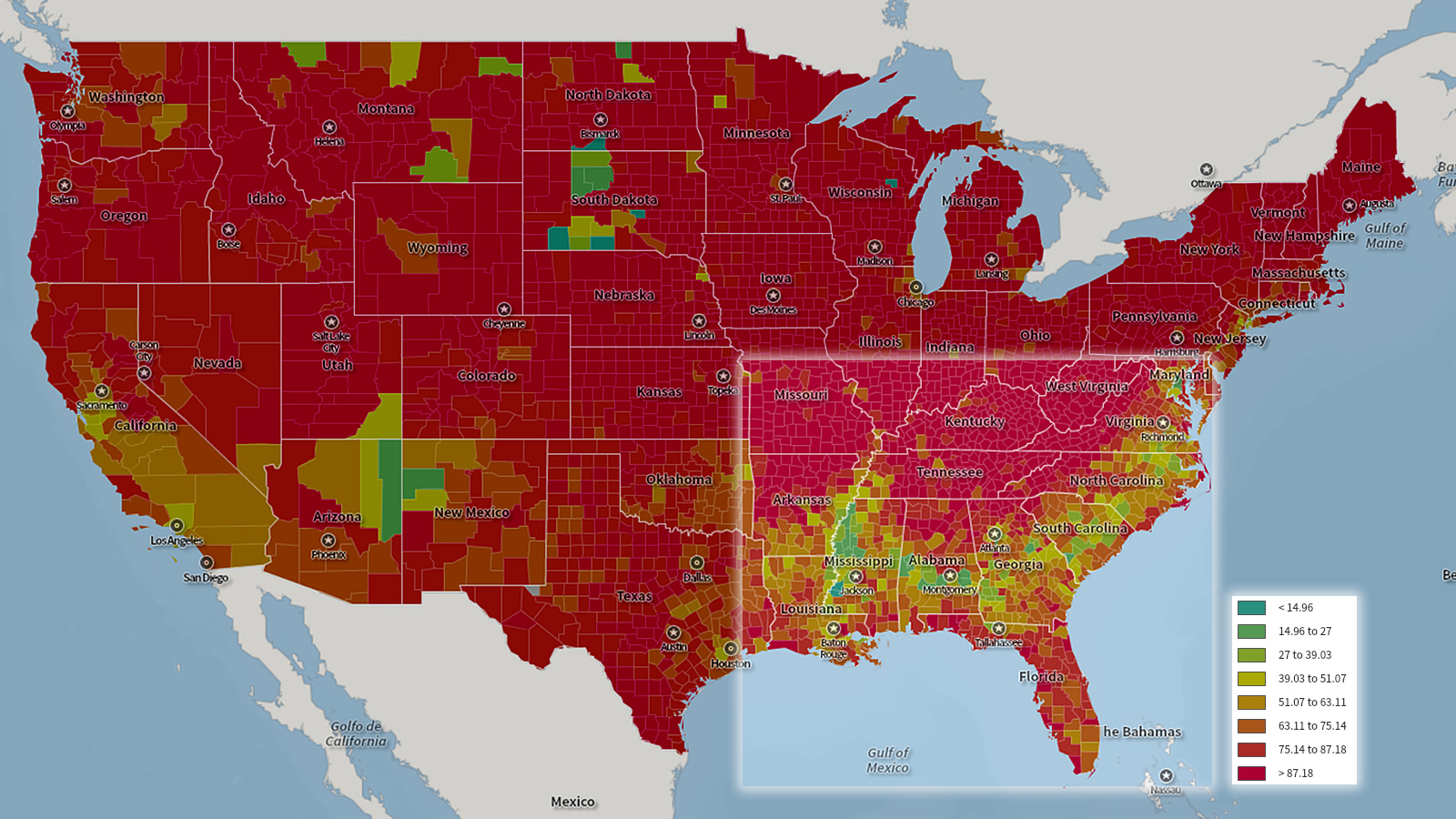
Population, 2010
Source: U.S. Census. Image by Center for a Better South using SocialExplorer.com.
There are two maps for population based on 2010 Census data: Percentage of white people and percentage of Black Americans.
Percentage of white population in the South with the darker red being higher percentages of whites.
Percentage of black population in the South with the orange and red being higher percentages of blacks.